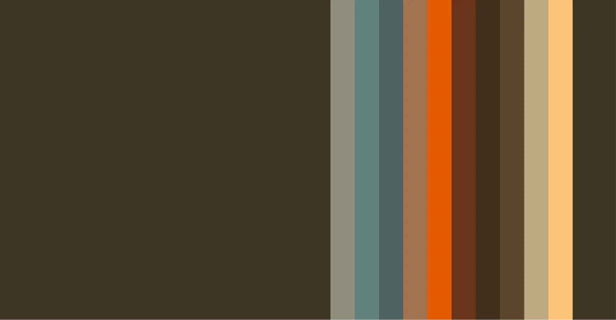
AureumNovari’s color palette is inspired by natural luxury and modern sophistication. Our primary hues—deep charcoal, warm gold, and soft ivory—reflect an atmosphere of refinement and exclusivity. Secondary tones, such as muted earth tones and rich jewel shades, add depth and versatility, allowing for elegant yet adaptable branding. The balance of light and dark colors creates a sense of contrast and harmony, enhancing our visual identity across print, digital, and product applications. Consistent use of our color palette ensures a cohesive and recognizable presence, reinforcing AureumNovari’s aesthetic of timeless sophistication and contemporary elegance.

HISTORY OF COLOR
AureumNovari’s signature color palette has evolved over the decades, each shade deeply rooted in the brand’s heritage, craftsmanship, and design philosophy. From the beginning, color has played a vital role in shaping the identity and aesthetic of AureumNovari, reflecting both nature’s beauty and the brand’s commitment to timeless luxury.
When AureumNovari was founded in 1902, its furniture was primarily crafted from light birch wood, symbolizing purity, warmth, and natural refinement. Birch became a hallmark of the brand, representing sophistication and artisanal craftsmanship. This soft, neutral tone served as the foundation for the brand’s identity, evoking the elegant minimalism found in early European design.
As the brand expanded and embraced more global influences, earthy hues—deep browns, rich taupes, and muted ochres—became prominent. Inspired by the rustic beauty of the Italian countryside and the organic textures of natural materials, these colors embodied a sense of warmth and grounded luxury, perfectly complementing the handcrafted woodwork of the era.
By the mid-century, AureumNovari’s design aesthetic evolved with a nod to modernism and a deeper appreciation for nature’s elements. Sea-inspired blues and deep teals became integral to the brand’s visual language, evoking tranquility, depth, and timeless serenity. These hues reflected the coastal landscapes of the Mediterranean, reinforcing the brand’s connection to nature and fluidity in design.
EXTENDED COLOR PALETTE